

Putting data on maps to show relationships
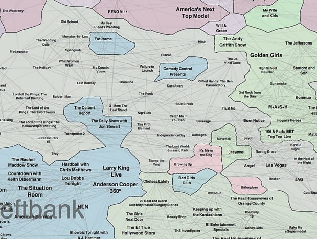
This map reveals show-to-show similarity, based on viewing patterns from one month of 2009 data from more than 1 million subscribers to a digital TV service. Some countries correspond to channels, like PBS, whereas others correspond to programs with similar themes that are on different channels. The central countries shown here, Middlelands and Lowlands, contain the most popular shows, which are neither on the same channel, nor particularly similar. The full map: cs.arizona.edu/~kobourov/PROJECTS/TVLand.png
As featured on

Information visualization is essential for understanding connections and patterns within lar…

